Thursday, 5 May 2011

My final Animation.


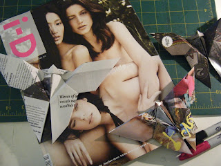
Im really happy with my final animation, I really like opening title part of the animation, which fits into the Magazine and insect themes in this animation.

However I feel that the even thought the idea was inspired from my music, with the development and changes made to the initial idea this final animation does 100% fit in with the music.

Animation Opening...

This is the opening I have made for my animation, I decided on the title of 'Paper Play'.


I cut out a shape which was one half of the butterfly form, and scanned it into photoshop where i created these letter forms. the animation is simple but adds a little more fun to the opening.


Post-it Style Animation Practice

I still wanted to investigate with other methods of animation, and I really wanted to try out this kind of animation because I found some really interesting and elaborate examples on youtube during my research process, and I just wanted to try it out in a simple way.

Tuesday, 3 May 2011

Symmetry Text...

Playing around more with the idea of symmetry and with the development of the text aspect of my animation, I have created these possible variations on the idea, and how I produced them.


First, I cut out a stencil that I could use to get an accurate shape for the letters, then I picked two pages from the magazine to make the into the 'The End' letters, once this was finished I took a photo that I could use to adjust in Photoshop (Scanning will allow for a better finish when creating the actual final message).


This first design has all the background removed, this allows the text to be even easier to read and distinguish,  and it still looks like a butterfly form.


This form has been skewed so that it has a more natural positioning and with match better with the angles used in my animation.


This still has some of the background remaining and this makes the shape of the butterfly more distinguishable but the text is slightly harder to read.

Sunday, 1 May 2011

Symmetry.

The thing that everyone knows about butterfly is that their wing patterns are symmetrical, which is why I wanted to try to recreate this with these two origami butterfly forms.


I think these two butterfly forms look good, but they can never be symmetrical when making them with pages of a magazine... which is why I have altered them in photoshop.


These butterfly forms look better now and although it isn't something I can recreate in my animation it is a method that I could possibly use in the generation of the text aspect of my animation.

Text Development...

Trying out other methods and possible ideas for how I will present the text aspects of my animation I have produced two more simple ways that I could so.


This methods looks good still, but with the flashing of this animation it looks a little frantic... I like the type made with the magazine pages and it will tie in well with my animation. could do with further development.


This method is just simple handwriting and would be good for a hand-drawn animation but not as well suited to my style of this animation.


I'm still not quite sure what I will call my animation, which is why it is difficult to chose a method of presenting the text. However I know that at the end it will say 'The End' so its an easy place to start.


Saturday, 30 April 2011

Text Text Text

Of course my animation need to have some text, simply to give the title and other basic info. It only needs to be simple and obviously easily readable.

To demonstrate my exploration I created this mini animation...


There is no reason why I cant have fun with animating the text aspects of my video, and I know I don't want an ordinary computer typed intro. to my animation.

The Making Of...

My animation took quite some time, and here is a 'behind the scenes' look into how I made it and the characters in it.

The Set...


'The set' consisted of three A1 sheets of white card, very carefully taped together, two ordinary desk lamps and an up-turned bin with a small tripod blue-tacked to the top. 

The Cast...


Twenty-fiveish Origami Butterflies made up the main portion of the characters in my animation


Seven Snails took a ridiculous amount of time to make because I kept accidentally ripping them in half and having to make new ones.


Two tricky Grasshoppers which you can barely notice are there from through the mass of paper.


The same stands for this lone Beetle which you may have never seen in between all the butterflies.

My Animation so far...

This is my animation so far, it hasn't yet been refined or edited.
Its only at 10fsp so is a little slow.


There are parts that I love like the beginning, with the opening of the magazine and the first few foldings of paper, and the ending when all the insects are crawling away. However to me the middle is quite messy (which at the time I was trying to create) and because of the nature of the magazine pages it is hard to distinguish the origami forms apart at first.

Also the initial idea of a sunny day with insects and butterfly buzzing around which was inspired by my allocated music is only vaguely related to this and I'm worried the two won't fit together well.

Animation Timeline...

Before I start my animation I need to plan it out so that I can control what happens and when it happens. I have drawn up this simple timeline so that I know when things will start and how long they should last


Thursday, 28 April 2011

Snail Origami Form...

From my mini research session at the library this is the only insect-ish thing I could find in any of the books, despite this I really like it and could make it to my animation. All I need to do it see how it looks and works with in my ID magazine paper and with all the other forms I have made so far.


Don Hertzfeldt

When I found this video I immediately loved it, its very simple in parts but works really well and the techniques used at the ending of animation are something I haven't seen before.


I think that I will have a small practice of some of these methods and this technique of animation.

Animation Backdrop...

Thinking of ways to develop my animation I wanted to look at the environment that I want my animation to take place, a plain white backdrop would make the most sense but I thought it sensible to check out some other options.


I still think that the simplicity of having a white background will work best, and wont be over powered with all the movement, colours and shapes going on.


On my desk would look like a more natural place for a magazine full of origami insects to be kept,  but it is quite messy and could distract from the main action.


A bush would be a more natural pace for insect to be but being outside can cause some problems with lighting and will have time limits.


On a simple path will be interesting but will have the same problems with being outside as the previous.

Insect Research...

I thought that it would be important that I do a bit of researching into insects and what they look like and how they move or fly.


These are some of the insects I have looked at when creating origami forms, however I need to look further into the movement of these creatures, like how the fly or crawl.

The flight in slow motion looks very exact, whereas in normal speed  the flight looks very erratic and you cant see much defined movement.

Chain Trial...

I spent a few hours drawing editing and adding colour to these first frames of my 'sea life' animation so I thought that it would be a waste if I didn't at least piece them together to see how they looked.


Its very juddery, but it works and you can see that the chain is going up and down. (I need to use Aftereffects, because the max I can get this program I used here is 9 fps)

Shopping...

Ive just got back from a small shopping trip... collecting things that I will need for the animation.

  • Magazine - In the shop I decided to get ID magazine rather than Vogue, when looking at them both, they have a similar amount of full page images and ad.s which will be best for my origami forms, its also slightly bigger which will allow me more freedom to make different sized forms. The thing I liked abut the butterfly form I made from the NME magazine page was that it wasn't as glossy as the others, and ID's pages are also less glossy and will look better when photographed.
  • 3 Sheets of A1 White Card - I bought these for the backdrop of my animation (although I'm not 100% sure how or where to do the animation, a real life setting - indoor or outdoor - could look really interesting)
  • 1 Sheet of A1 Grey Card & 1 Sheet of A1 Black Card - I got these to create some movement or action in the background (not 100% sure on how yet).
  • I've also got some Masking Tape, Double-Sided-Sticky-Tape, and some Fishing Wire for fixing.

Mood and Colour

The mellow mature of my song will of course mean a mellow colour selection, due to me using a magazine as the media of my origami this means it is difficult to control the colour, because I will be using every page.
However, if I have a plain white background to my animation then this will reduce the impact of bright colours and make the overall look more subdued and tranquil.

Wednesday, 27 April 2011

Character development- Paper type

Using plain white paper from the material of my origami forms isn't the most exciting idea i've heard today, I also imagined the background to be a simple white also so there isn't going to be much contrast that way.


This made me want to investigate different materials that would make my origami forms more interesting, these are the few I looked at...


This form is made from a page of my NME magazine, the paper is non-glossy and doesn't have a load of colour, so creates quite a subdued monochrome butterfly. I like it But maybe not as playful as others,  however more colour could come from other pages. The paper is quite thin which makes it much easier to fold.

This butterfly is made from a page from my American Vogue Magazine, Vogue is a good magazine for this because it is full of ad.s which means plenty of full colour images to use. The paper is again thin which allows for easily folding and less chance of ripping. Will definitely make the animation fun and playful.


Was thinking with this to use any and all papers that I could find and not all be the same (bills/ newspaper/ adverts/ takeaway menus/ anything)... this is from a chinese takeaway menu. however when using anything its difficult to know how the paper will fold until its folded, this was thick and not as easy as the others.


A rainbow of coloured cartridge paper was my next idea (brown was the only I had to hand). Its very thick and difficult to use, and will be impossible for more elaborate designs.


A page from my Front magazine, this is pretty much the same as my American Vogue in paper quality (thin and glossy). I think this and the Vogue butterfly look the best and will probably -with more development- end up in my animation.

Animation Characters...

The animation is going look better the more diverse I can be with the origami insect forms I can find to create, because I'm not an origami master (yet), the only ones I have been able to find are from the internet (wonder if there is a book in the library). This has hindered the number I have created so far... but here they are...


This first one is a Rhino Beetle (I think) by far the most difficult one I have done so far and took me over 20 minutes to do... it is only the first so I need more practice because its a bit messy.


This form is a Grasshopper, and is made of two separate pieces of origami that are put together to create this whole, which could make it more interesting by mixing two different colours or patterns.


This form is a generic beetle... very simple and I don't think is very convincing of being a beetle... possibly this design wont make it to the animation.


The butterfly is one of the easiest and i have practiced it a few times in different sizes, colours and patterns. I think this will be a good one for the animation because it will b able to fly away (not sure how I will do this) and make it more interesting.


Also... there are quite a few books on origami in the library (just checked online) so I will pick up a few tomorrow, and see if there will be more interesting designs.

What my Brain Box Thought of... from my Allocated Music.

Just realised that I haven't yet made a post on my feelings and thoughts towards my allocated song which has inspired all of the ideas that I have been developing these past weeks...

Im in Group 2... Which means my song is... 3:25 - Clutchy Hopkins!

I find this quite a difficult song to describe but it still gave me quite a few ideas that i could start from


Its a very small list but i soon chose what my 3 words would be and then generated my ideas from there...


I soon found that my word choices were different to most peoples in my group, but I suppose everyone get different ideas. 
One of the first things that I thought of was 'Sunny Days' and 'Under the Sea', mainly because of the slow mellow nature of the song.

Orgami Spawn Animation- Storyboard


1. A simple stack of paper begins the animation.


2. From this stack the paper starts to fold itself.


3. The paper keeps folding its self with the mass of paper getting bigger and bigger.


4. From all this folding a mass of origami insects appear.


5. The insects begin to flee away from the area and out of the edge of the screen.


6. The flying insects fly away and the ground insects crawl away.

Origami Initial Idea!

This is the page that I made from the initial idea that I got.
Its a simple story board that definitely needs development but its fun, simple and ties in well with the music and some of the key ideas that came from my 3 chosen words.